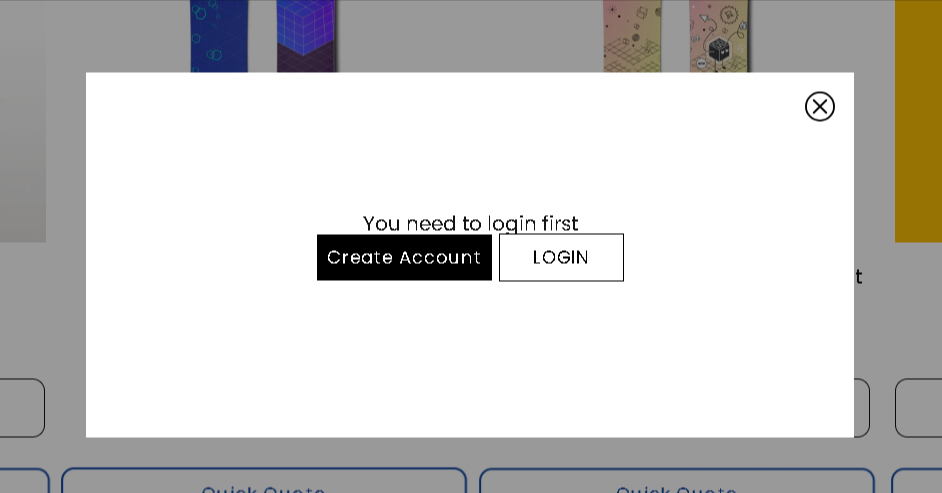
Requiring customers to log in before submitting a quote request helps you collect essential data and ensures you are receiving qualified leads. With Quotes Guru, you have the flexibility to allow guest checkouts or restrict access to registered members only. You can also fully customize the Login and Create Account buttons to ensure they match your store’s unique branding.
Steps to Enable Login Requirements and Style Your Buttons #
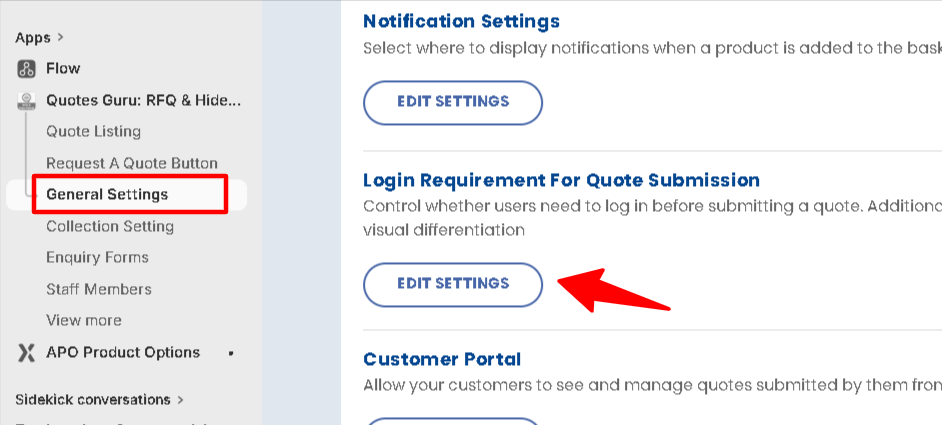
- Go to General settings
- Scroll below and find the login requirement for Quote Submission
- Click on the Edit settings button
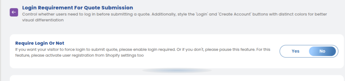
1. Enable Login Restriction: #
Toggle the “Require Login” switch to ON. This ensures the quote form only appears for authenticated users.
2. Configure Redirection #
Decide where guests should be sent when they click the quote button—either to your Shopify Login page or to open a login popup first.
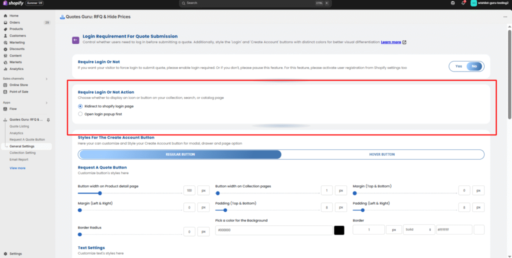
3. Customize Create Account Button Appearance #
Customise the appearance of the Create Account button for the modal, drawer, and page options.
Regular Button Settings:

- Width: Set the width of the button.
- Margin (Top & Bottom): Adjust the margin space on the top and bottom of the button.
- Margin (Left & Right): Adjust the margin space on the left and right of the button.
- Padding (Top & Bottom): Set the internal padding of the button.
- Padding (Left & Right): Set the internal padding on the left and right of the button.
- Border Radius: Adjust the roundness of the button’s corners.
- Pick a Color for the Background: Choose the background color of the button.
- Border: Set the border thickness and style (e.g., solid).
Text Settings:
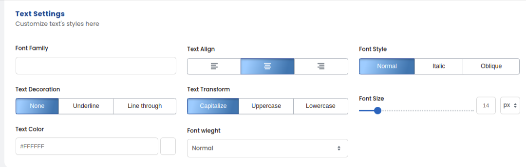
- Font Family: Choose the font for the button text.
- Text Align: Set the alignment of the text inside the button.
- Font Style: Customize the style of the text (e.g., normal, italic).
- Text Decoration: Add text decorations (e.g., underline).
- Text Transform: Set text to uppercase, lowercase, or capitalize.
- Font Size: Adjust the font size of the text on the button.
- Text Color: Pick the text color.
- Font Weight: Choose the font weight (e.g., normal, bold).
Hover Button Settings:
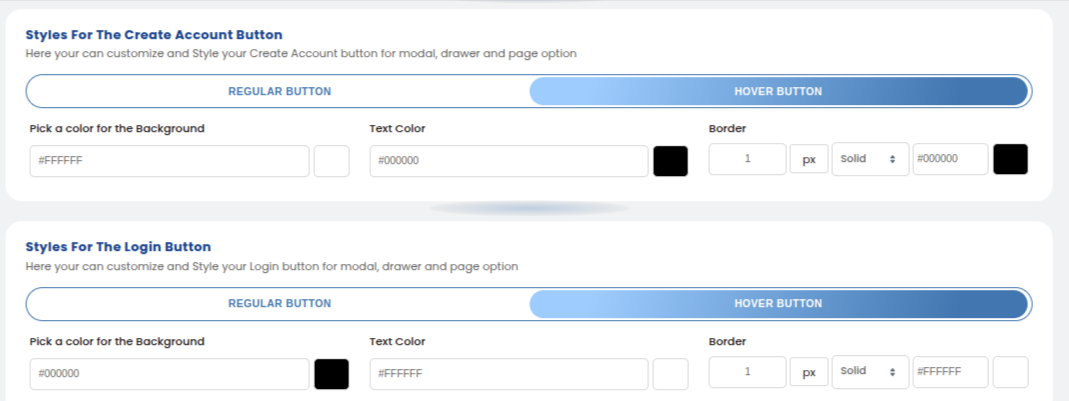
- Pick a Color for the Background: Choose the background color of the button when hovered.
- Text Color: Select the text color when hovered.
- Border: Set the border thickness and style when hovered (e.g., solid).
3. Customize Login Button Appearance #
The Login Button customization settings are the same as those for the Create Account Button, as described above. This includes:
- Regular Button Settings: Width, Margin, Padding, Border Radius, Background Color, Border, and Text Settings.
- Hover Button Settings: Background Color, Text Color, and Border for the hover state.
With this setup, you can ensure a consistent and visually appealing design for both the Create Account and Login buttons across the site. Let me know if you need further modifications!
Please check the image below to see how it will be shown in the Front End :