One of the standout features of our app is the Customise Quote Forms dashboard. This feature allows you to effortlessly manage and tailor every form you’ve created for your Shopify store, streamlining the way customers request personalised quotes.
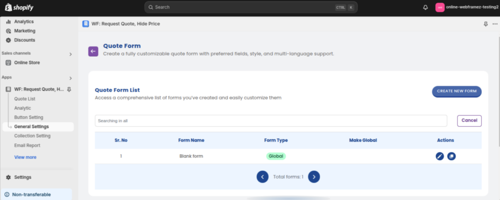
Through the Quote Form List, you can access a comprehensive overview of your entire setup. At a glance, you can see key details such as form names, types, and ‘Global’ status (indicating if a form appears across all pages). This centralised organisation ensures you can stay on top of your quoting strategy and make quick adjustments as your business grows.
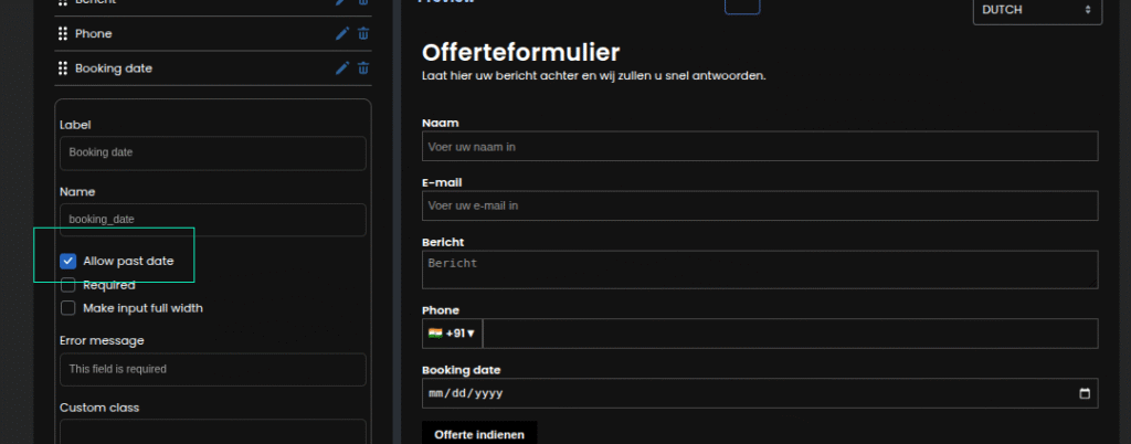
The best part? You can customise your forms to match your store’s branding and customer needs. Whether it’s adding fields for more information (like phone number, address, etc.), adjusting the form’s layout and style, or incorporating multi-language support to cater to your global audience, this feature makes it all possible. You can even select different languages for your forms based on the shopfront languages you’ve set in your Shopify settings. Please watch the video for detailed analysis of this feature:
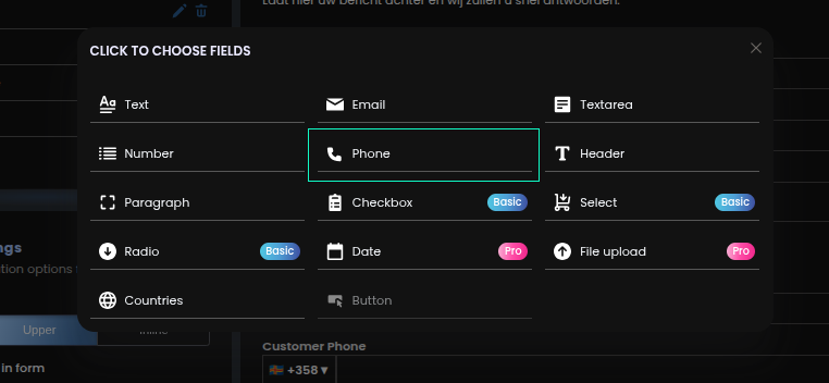
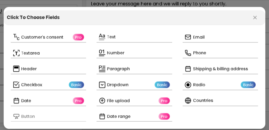
One can also add a New Field, which will give you more options, like uploading files (in PRO plan) We’ve introduced a new phone field in the quote form: this field is available under all plans and comes with country code support.
This field allows you to add a checkbox to the form where customers can acknowledge or agree to specific terms, disclaimers, or policies. It’s ideal for capturing user consent during quote submissions.
We’ve introduced a new phone field in the quote form that supports country code selection. This makes it easy to collect international phone numbers accurately.
To enable the Phone field: Go to General Settings > Quote Form > Edit Form, and add the Phone field.
Tip: You can also add a new field, which unlocks more advanced options like file uploads (available in the PRO plan only).
Radio buttons offer a clear way for customers to select only one option from multiple predefined choices. Useful for mutually exclusive selections like size or urgency level.
This field allows users to upload documents, images, or other files with their quote request. It’s ideal for custom jobs, reference files, specifications, or order requirements.
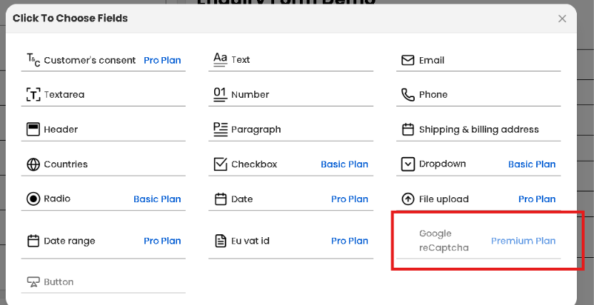
Our newest field, Google reCAPTCHA, protects your quote and enquiry forms from spam, bots, and automated abuse. Once enabled, customers must complete a simple “I’m not a robot” verification before they can submit a quote or enquiry request – keeping your submissions clean and genuine.
Why add Google reCAPTCHA to your quote form?
Blocks automated bot and spam submissions
Keeps your quote and enquiry inbox focused on genuine customer leads
Adds a trusted, familiar layer of verification customers already recognize
Requires no coding — enable it directly from your form builder
To enable the Google reCAPTCHA field: Go to General Settings > Quote Form > Edit Form, and add the Google reCAPTCHA field.
So, whether you’re offering tailored quotes, negotiating pricing, or gathering additional details from customers, the Quote Form List ensures the process is simple, efficient, and fully customisable to fit your store’s needs.
Success Message After Submitting Quote (All Plans)#
This feature allows you to display a custom success message to customers once they submit a quote. It enhances the user experience by confirming that their quote request was successfully received.
You can customise this message to thank the customer, inform them about next steps, or simply provide confirmation.
To set this up: go to General Settings > Quote Form Customisation > Edit or Create Form, and scroll to the Success Message section.
Image Upload Option for Success Message (All Plans)#
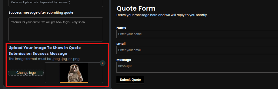
In addition to the text-based success message, you can also upload an image that will be shown after the quote is submitted. This could be a thank-you banner, brand image, or promotional graphic.
The uploaded image will appear on all the forms the admin has created — helping you keep post-submission branding consistent.
To upload an image:
Go to General Settings > Quote Form Customisation > Edit or Create Form > Additional Settings, and locate the section after the success message area.
You now have direct control over whether prices are included in the automatic acknowledgement emails and PDFs sent to your customers. By simply toggling a checkbox within your specific quote form, you can ensure your pricing remains private until you’re ready to finalise the quote.
If the user has chosen Pro or Premium Plan then it unlocks “Multiple form” feature how to access this click here#
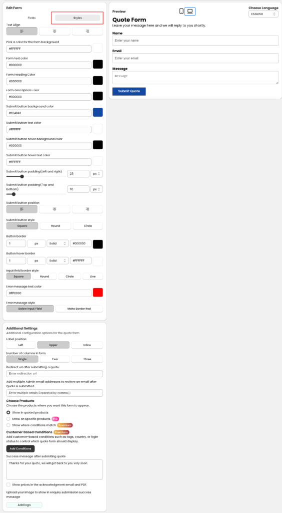
The Styles tab (highlighted in red in your image) allows you to change the visual appearance of the form to match your theme.
Text & Background Colours: Customise the background, heading, and description colours to ensure the text is readable.
Submit Button Customisation:
Colours: Set the background and text colour for both the standard and hover states.
Shape: Choose between square, round, or cill (pill-shaped) styles.
Padding: Use the sliders to adjust the button’s size (Left/Right and Top/Bottom).
Input Field Style: Choose how your form fields look (e.g., square, line, or round) and customise the error message colour (typically red) to alert users to missing information.
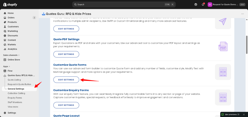
Go to General Settings → Customize Quote Forms → Edit Settings in your Shopify admin. From there you can add fields, change styling, and adjust layout for any quote or enquiry form.
Yes, on the Pro and Premium plans you can create and manage multiple quote forms and assign different forms to different products or collections. See How to Create and Manage Multiple Quote Forms.
Yes. Quotes Guru supports multi-language forms based on the storefront languages configured in your Shopify settings, so international customers see the form in their own language.
No — you need to add it to your form and save your changes. Once added and marked as required, it will appear on your live storefront form, typically just above the Submit button.
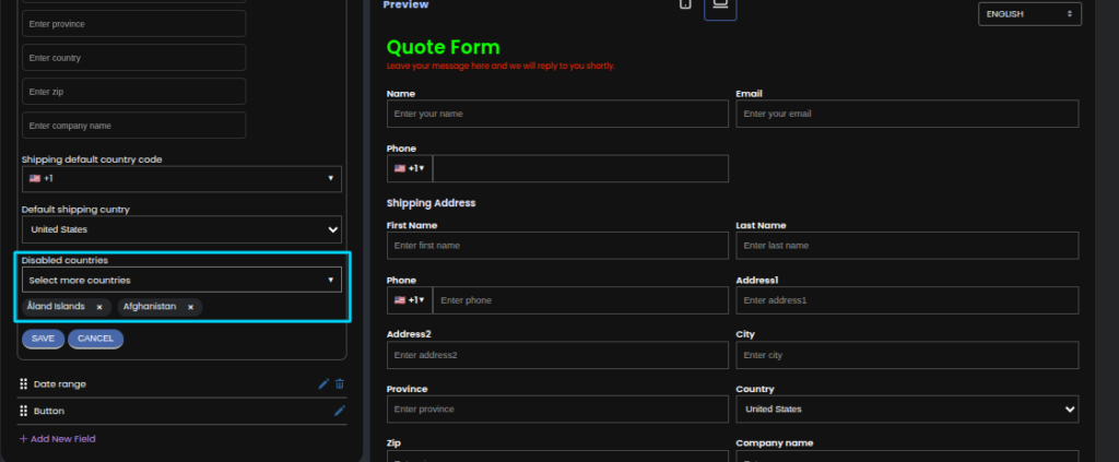
Yes. You can exclude specific countries from both the standalone Country field and the Shipping Address → Country dropdown — useful if you only accept quotes from certain regions.
It adds a checkbox customers must select to acknowledge terms, disclaimers, or policies before submitting a quote — helpful for compliance and clear recordkeeping.
Checkbox, Dropdown & Radio Fields (Basic Plan and Above)#
Checkbox lets customers select multiple options, Dropdown lets them pick one option from a compact menu, and Radio buttons let them choose exactly one option from a visible list — useful for mutually exclusive choices like size or urgency.
Yes. You can set a custom Success Message and optionally upload a branded image (like a thank-you banner) that appears after submission across all your forms.