You can easily customize the “Request for Quote” button on your product pages, home page, or collection pages to match your store’s look and feel.
Whether you’re using the Quick Quote or Basket Quote button (or both), you can adjust how they look and behave — including their color, size, text, placement, and hover effects.
This guide will show you how to style and personalize your quote buttons using the Quotes Guru app, so they fit perfectly with your brand and make it easier for customers to request a quote.
How to Access the “Request for Quote” Button #
Follow these simple steps to access and customize your quote button:
Step 1: Go to your Shopify Admin and open the Quotes Guru app.
Step 2: From the left-hand menu, click on Request quote Button Settings.
Step 3: You’ll see options to customize both the Quick Quote and Basket Quote buttons.
Display Buttons #
This setting allows you to choose which button(s) will appear on your product pages. You can select one or both options based on your store’s needs:
- Quick Quote Button:
Displays a button that allows customers to request a personalized quote for a product. Clicking this button will prompt customers to fill out a quote request form, making it easy for them to inquire about specific pricing or deals. Read more - Basket Quote Button:
This button allows customers to add multiple items to their quote basket. It’s ideal for customers who are interested in receiving a quote for more than one product at a time. When they’re ready, they can submit the entire basket for a tailored quote : Read more - BOTH: Quick Quote + Basket buttons (In Premium Plan)
This feature is available in Premium plan, This is very unique feature which will allow users to use both Quick Quote buttons and Quote Basket functionality simultaneously. In this option we will allow users to create multiple custom forms and link relevant products to those forms and on all such products which are related to any Custom form it will show Quick Quote buttons and will open up their respective forms and for all other products which fall under Global Form it will show ADD TO QUOTE BASKET buttons.
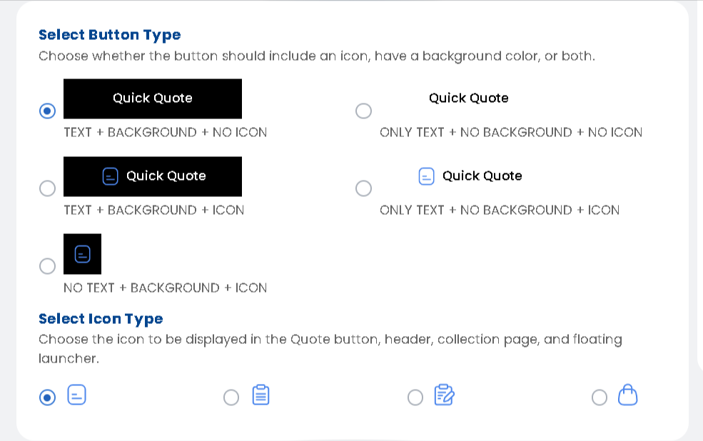
How do you want to show the Quote button: #
Choose whether the button should include an icon, have a background colour, or both.
Button States: Regular, Hover, and Active (Note: If you choose it as a quick button, only the regular and hover options will be available) #

These states allow you to customise how the button appears in different user interactions.
- Regular State:
This is the default appearance of the button when it is not being interacted with. You can customize the background color, text color, and other styles that users will see initially. - Hover State:
The hover state refers to the appearance of the button when a user hovers their cursor over it. You can set a different background color, text color, or add effects to make the button visually interactive when users are about to click. - Active State:
The active state is the appearance of the button when it’s clicked or being pressed. This is the state where you can adjust the button’s styling to show feedback when the user has engaged with it (e.g., changing its color, adding shadows, etc.).
Button Styling #
Adjust the button’s appearance to match your store design:
- Width: Set the width of the button (as a percentage or fixed size).
- Margin (Top & Bottom): Control the spacing above and below the button.
- Margin (Left & Right): Adjust the spacing on the left and right sides of the button.
- Padding (Top & Bottom): Set the internal space above and below the text inside the button.
- Padding (Left & Right): Control the internal space on the left and right sides of the button’s text.
- Border Radius: Round the corners of the button to give it a softer look.
- Background Color: Choose the button’s background color to match your store’s theme.
- Border: Adjust the border width and style (solid or dashed).
- Animation Type: Choose an animation style for button interaction (e.g., none, hover effects).
Text Settings #
Customise the text style for your button label:
- Font Family: Choose the font type for the button text.
- Text Align: Set the alignment of the text (left, center, right).
- Font Style: Apply italics, bold, or other styles to the text.
- Text Decoration: Add underlines or strikethroughs to the text if needed.
- Text Transform: Adjust text to uppercase, lowercase, or capitalize.
- Font Size: Control the size of the text in the button.
- Text Color: Select the color of the text to make it stand out.
- Font Weight: Set the thickness of the text (normal, bold, etc.).
Let’s see how we can change the buttons’ display on the admin side and how it reflects on the front end :
Check Admin Demo #
We’re excited to give you a preview of our app’s powerful admin features. With this demo, you’ll be able to experience how the app can work for you:
1. Access the Admin Demo: https://quote-guru-admin-demo.myshopify.com/admin 2. Login Details: Email: testtheformfill@gmail.com Password: 123456789


